Ardent Sports
Case Study:


Client:
Ardent Sports
Role:
Lead Creative Graphic/Motion Designer — Concept, Design, Animation, and Delivery
Objective / Challenge:
Complete rebrand of identity + promotional video to showcase the new branding.
Create a refreshed brand identity that better reflects Ardent Sports’ global ambition, technical expertise, and aspirational values (performance, innovation, sustainability)
Develop visual assets (logo, typography, colour palette, iconography, etc.) that can be used across digital, print, and environmental graphics (on-site signage, etc.).
Produce a showcase video that:
Presents the new identity in motion
Reinforces Ardent’s leadership in high-performance sports infrastructure
Highlights key strengths: strategic planning, design, project delivery, sport-science integration
Inspires trust among clients (e.g. elite sports brands, clubs, institutions), ensuring the identity works at many scales and contexts: large‐scale infrastructure, training centre signage, digital, and small print.
Below are proposed components for the new identity:
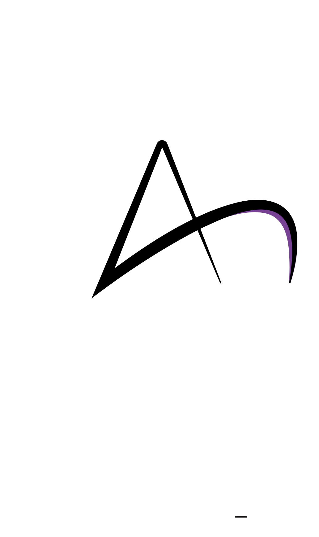
Logo redesign: More modern, streamlined mark that suggests forward motion, infrastructure, precision. Possibly incorporating geometric forms / dynamic lines to connote performance, movement, and structure.
Typefaces: A strong headline font with a technical/architectural feel; a clean, legible sans serif for body text.
Colour palette: Lean into bold contrast—strong accent colours (e.g. sports-centric colours like deep blues, dark greys, greens) balanced with neutrals for professional/sustainable feel.
Iconography / Graphic elements: Visual motifs that reference structure, grids, athlete movement, elements of sports science (biomechanics, zones of training, recovery) to give texture across statements, presentations, maps, etc.
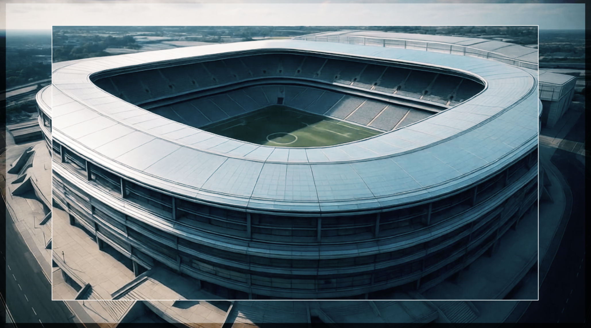
Photography / Imagery: High contrast, clean architectural photography; images showing both athletes and infrastructure; details (lighting, materials) that reflect quality, precision, human scale.


Round One:


Storyboard:


Set Back:


After the first round of exploration, a decision to continue to refine the concept was made, developing a more structured logo and visual elements that could form the core building blocks of the brand’s future identity.


With the script approved, the client brought in a design agency to shape their new website. This collaboration sparked new ideas for the company’s rebrand. The original silhouette style, chosen for its nod to the brand’s heritage, was replaced, while the visual approach expanded to include richer video and photographic content.


Outcome:
Key Takeaways
Clearer differentiation from competitors—positioning Ardent as both high-performing and technical expert.
Stronger emotional resonance with clients: not just “we build sports facilities,” but “we create environments for elite performance, sustainability, innovation.”
Consistency across touch points (website, proposals, signage, video) that reinforces brand trust.
Enhanced ability to win big contracts/projects through perception of coherence, professionalism, modernity.
Better marketing collateral (video can be used online, in pitches, trade shows, social) to amplify reach.
Tools Used:
Adobe After Effects, Illustrator, Photoshop, Premiere Pro